How the Maps Were Created
From the information in the diaries, a spreadsheet was created to record place names and dates. Geographic coordinates, information about leaves, the duration of time spent in each location, types of visits, etc. were also added to the spreadsheet. Once fully populated, this spreadsheet then became the basis for creating a database to be used to make the maps. Several cloud-based mapping, analysis and visualization tools such as MangoMap, MapBox and Google Fusion Tables are readily available for creating web-based maps. CartoDB was chosen to map the data and to create the data visualizations. After uploading a spreadsheet to CartoDb, the data is available for plotting on interactive maps. It can be queried using CartoDB’s SQL query function to create smaller data sets that can answer questions such as “Where did Harry Colebourn visit in 1915?”, “Where did Harry spend his leaves?”, and “Where did Harry spend most of his time in 1916”?
Once the data that answers any one of these questions is pulled from the database, it can be used to create visualizations that are superimposed on maps. Tools built into CartoDB allow customizing the map canvas, how the data is mapped and what information is displayed as the end user interacts with the map. Depending upon the type of question be asked, maps can feature time-lapse animations to show movement over time; colour-coding to quickly differentiate places visited during each of the war years and intensity mapping to reveal length of time spent in each location.
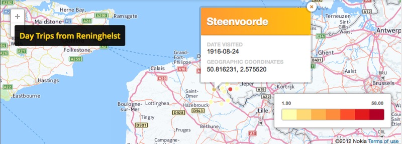
CartoDB map with sample customizations.
Page 4 >